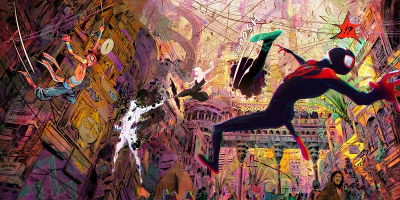
Spider-Man: Across the Spider-Verse arrives in cinemas this weekend, five years after Spider-Man: Into the Spider-Verse served as a breath of fresh air. It’s an artistic and creative triumph for everybody involved and a joy to behold. However, there is also a sense of frustration in watching it. Five years ago, Into the Spider-Verse threw down a gauntlet in terms of blockbuster superhero storytelling, and so far Across the Spider-Verse is really the only superhero film to answer that challenge.
Into the Spider-Verse and Across the Spider-Verse are incredibly vivid works of pop art. Setting aside their ambitious and thematically rich narratives, they are consistently dynamic in terms of visuals. They find a way to bring the visual language of comic books to the big screen: split screens, caption boxes, animated collages, “Kirby Krackle,” cross hatching, and so much more. Watching these two films is akin to watching a comic book come to life.
More than that, Into the Spider-Verse and Across the Spider-Verse are the rare blockbuster superhero films to celebrate artists, who are an essential part of the collaborative creative process in crafting a comic book. Adaptations of comic books tend to focus on the scripts and the writers, tending to acknowledge the adaptation of plot points or dialogue from source comics, while often overlooking the importance of distinct art styles and sensibilities as part of the storytelling.
Watching the Spider-Verse films, it’s possible to spot obvious and deliberate homages to specific art styles, from Bill Sienkiewicz and Sara Pichelli in Into the Spider-Verse to Robbi Rodriguez and Francesco Francavilla in Across the Spider-Verse. There is an understanding that comic books are more than just “gossip about imaginary people.” The Spider-Verse films accept that comics are an artform that unifies both narrative and visual storytelling, embracing both sides of that equation.
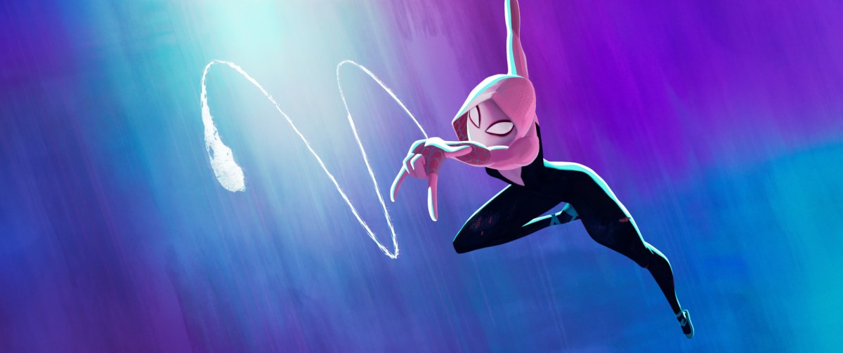
Gwen Stacy (Hailee Steinfeld) in Columbia Pictures and Sony Pictures Animations SPIDER-MAN: ACROSS THE SPIDER-VERSE.
To be fair, the influence of Into the Spider-Verse has been felt in some corners of the film industry, most notably in animation. Recent American animated films like The Bad Guys and Puss in Boots: The Last Wish have demonstrated a willingness to embrace heightened stylization and cartoonishness within the framework of computer animation. These films engage with different art styles, like anime, in ways that demonstrate the potential of animation as a visual medium.
However, it is slightly frustrating that superhero movies have yet to embrace even a fragment of the visual potential suggested by Into the Spider-Verse and Across the Spider-Verse. Despite the fact that these comic book movies are inspired by striking pop art visuals, the Marvel Cinematic Universe (MCU) is famously dominated by a fairly generic color-corrected aesthetic while rejecting even the modest stylization of something like the first two Blade movies.
The Spider-Verse movies are multiverse movies — stories about characters journeying across an infinite number of alternate worlds. There have been plenty of live-action comic book films and shows working with the same conceit: Loki, Spider-Man: No Way Home, and Doctor Strange in the Multiverse of Madness. However, none of those projects show any real interest in being visually adventurous or ambitious, in using that high concept as a justification for mind-bending visuals.
To be clear, there are live-action superhero projects that do have distinctive visual styles. The work of cinematographers like Lawrence Sher on Joker or Greig Fraser on The Batman are rich and vivid in their own way, but they tend to sit at the extreme of visual stylization within live-action comic book movies. On television, Legion made a conscious effort to embrace the aesthetic of artist Bill Sienkiewicz, but it is the exception that proves the rule.
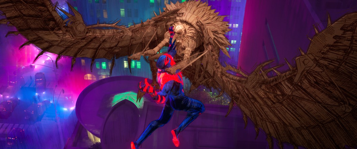
Miguel O Hara (Oscar Isaac) clashes with Vulture (Jorma Taccone) in Columbia Pictures and Sony Pictures Animations SPIDER-MAN: ACROSS THE SPIDER-VERSE.
It’s tempting to argue that the Spider-Verse films have an advantage in adaptation. They are, after all, animated. Animation is closer to traditional line art than live-action cinematography, and so it’s easier to translate particular images and styles into computer-generated animation than it would be to recreate them with actors and props. However, this ignores the reality that live-action comic book movies weren’t always quite as visually conservative as they are today.
In fact, Into the Spider-Verse and Across the Spider-Verse are perhaps best understood as spiritual successors to two of the earliest films in the modern comic book movie boom. Their recreation of comic book language in motion is an extension of what Ang Lee attempted in Hulk or Robert Rodriguez and Frank Miller were doing in Sin City. Those films use many of the same techniques employed by the Spider-Verse movies, like split screens, superimposed images, and crossfades.
If anything, the arrival of the MCU made comic book movies less comic book-y, at least in visual terms. This year marked the fifteenth anniversary of the release of Iron Man, the movie that set the template for so many of the live-action superhero movies that would follow. However, this is also the fifteenth anniversary of the Wachowski Sisters’ live-action adaptation of Speed Racer, which was released in cinemas the week after Iron Man and was crushed under the superhero’s heel.
Speed Racer has been somewhat reclaimed in the years since its release as a vivid piece of pop art, effectively a film translating the visual language of animation into a space adjacent to live action. Many of the retrospective reappraisals of Speed Racer contextualize its underperformance against Iron Man as a pivotal moment in the evolution of blockbuster cinema. In the years that followed, studio blockbusters would come to look a lot more like Iron Man and a lot less like Speed Racer.
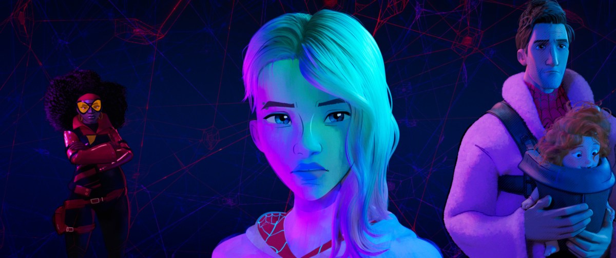
Jessica Drew (Issa Rae), Gwen Stacy (Hailee Steinfeld), Peter B. Parker (Jake Johnson) and his daughter Mayday in Columbia Pictures and Sony Pictures Animations SPIDER-MAN: ACROSS THE SPIDER-VERSE.
There is a lot of the Wachowskis in Across the Spider-Verse. Miguel O’Hara’s (Oscar Isaac) robot enforcers resemble the squid-like Sentinels from The Matrix. The film’s movement and color recalls Speed Racer. The structuring of the movie as the first part of a two-part finale in which the hero has to choose between one life and the fate of the universe recalls The Matrix Reloaded. Even the core themes, about how society is a machine built on suffering and exploitation, are quite Wachowski-esque. It feels of a piece with Speed Racer.
In the years since Iron Man, there are any number of examples of how live-action studio filmmaking has pushed the visual design of these superhero movies towards a blander aesthetic. To pick an obvious comparison from within the past year, the underwater sequences in contemporary blockbusters like Black Panther: Wakanda Forever or The Little Mermaid are much less visually interesting than comparable set pieces in James Cameron’s Avatar: The Way of Water. It’s possible for these things to look great; they just don’t.
Of course, the default defense against these criticisms is to point out that visual effects staff are both overworked and underpaid. This is entirely fair. Companies like Disney have a long and well-documented history of exploiting these workers. However, criticism of the way these movies look is not criticism of the visual effects artists working on them. If anything, it’s a criticism of the system that ruthlessly exploits those artists and pushes them towards this bland and homogenous style.
The climactic fight in Black Panther looks strange because it had to be farmed out to multiple special effects houses to meet the release deadline. Visual effects artists have talked about what it feels like to get “pixel-fucked” by producers and directors who know nothing about working with this technology and so push for longer hours on creative dead ends. The current conditions have forced many young artists to leave the profession, giving up on their dreams.
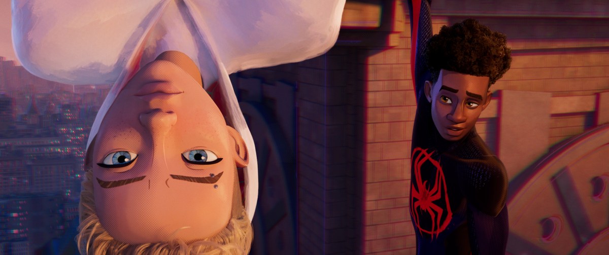
Gwen Stacy (Hailee Steinfeld) and Miles Morales (Shameik Moore) in Columbia Pictures and Sony Pictures Animations SPIDER-MAN: ACROSS THE SPIDER-VERSE.
It is possible to produce good art in an ethical way. Both Across the Spider-Verse and its sequel, Beyond the Spider-Verse, had their release dates pushed back because the production team needed “more time to make it great.” Looking at the finished product, it seems like that time was well-spent. Even James Gunn’s Guardians of the Galaxy Vol. 3, the best-looking of the recent Marvel Studios movies, looks as good as it does because the effects team “had the time and … were able to make it work.”
As such, many of the justifications for the very conservative and somewhat bland visual aesthetics of modern superhero blockbusters don’t really make sense. They are especially unconvincing at a point in time when there are rumblings of “superhero fatigue.” Ant-Man and the Wasp: Quantumania will reportedly fail to break even, providing the franchise’s worst box office since 2011. If audiences are tiring of the sameness of these movies, it’s the perfect opportunity to shake things up visually.
Recently, producer Amy Pascal announced that Sony was developing a live-action Miles Morales movie. While that’s certainly great news for fans of the character, there is a frustrating sense that any live-action adaptation will inevitably be less rich and vivid than the Spider-Verse films, that they will flatten the character down. After all, Sony’s efforts to produce a live-action multiverse Spider-Man movie resulted in No Way Home, a basically competent exercise in nostalgia with no visual identity.
Into the Spider-Verse and Across the Spider-Verse are “comic book movies” in every possible meaning of that phrase, right down to their celebration of Ben Reilly (Andy Samberg) as the affectionate embodiment of the worst excesses of 1990s comic book storytelling. They are vibrant, dynamic, and exciting. They are completely unashamed to be comic book movies, embracing the totality of the medium, lifting not just characters and plot points, but visual language and imagery.
The Spider-Verse movies have picked up the baton from Hulk and Sin City, raising the bar for cinematic comic book storytelling. Let’s hope that live-action adaptations can capture even some of that spark.
