
Pokémon Sword and Shield are upon us, but the eighth Pokémon generation has had to weather an overblown campaign of fan outrage to get here. Game Freak’s decision to scale back the sheer number of in-game critters to focus on overall polish has been picked apart by self-appointed internet sleuths, who are scrutinizing individual trees and walls for evidence of the series’s stagnation. But they’re looking in the wrong place. Pokémon is a series of many joys, but it’s also a series of many decades-entrenched, uncorrected frustrations. This series doesn’t need 800 monsters — it needs a total user experience overhaul.
When Pokémon Red and Blue came out in 1996, they were miracles of technology and design. The first generation games crammed 30 hours of adventure and 151 recruitable creatures into a single megabyte, and it made that odyssey perfectly legible on a screen that was just 2.6 inches from corner to corner. To ensure maximum clarity, text boxes did a lot of heavy lifting in Red and Blue. Battles took place between motionless cardboard cutouts, with plain text used to describe each monster’s actions and their consequences. Players were left to imagine the epic duels unfolding in their hands, with an assist perhaps from the more visually bombastic tie-in anime.
Nintendo’s handheld systems, the traditional homes of the Pokémon games, advanced a lot over the next 23 years, but Pokémon was always reluctant to advance with them. Successive entries in the series typically meant little more than the same plot and structure transplanted into a new location, with a few extra critters and gimmicks sprinkled in. This is fine — in fact, that decades-spanning consistency has been a major strength for the series. But in 2013, X and Y came to the comparatively powerful Nintendo 3DS. Around this time, many of the series’s recurring conventions stopped being necessary compromises to ensure maximum clarity and started being needlessly irritating holdovers from a more primitive era.
Plain text is still relied on to deliver a huge amount of information in the latter Pokémon titles, despite their increased visual fidelity and computational resources. Combat is still resolved action by action, each morsel of information demonstrated and re-demonstrated in redundant ways, at the sort of deliberate pace you would adopt to teach somebody how to play a tabletop game for the first time. The difference is that a tabletop session will become partly automated and more rapid as the game’s rhythms are internalized, while Pokémon never removes its one-step-at-a-time training wheels. For a series with such information-dense battles, this is a massive strain on the games’ momentum.
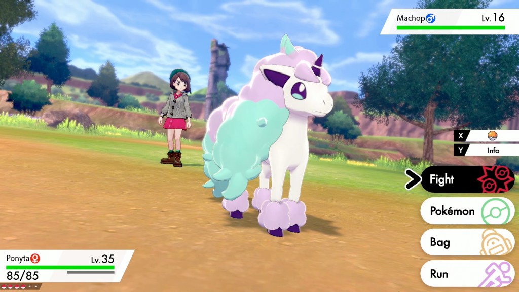
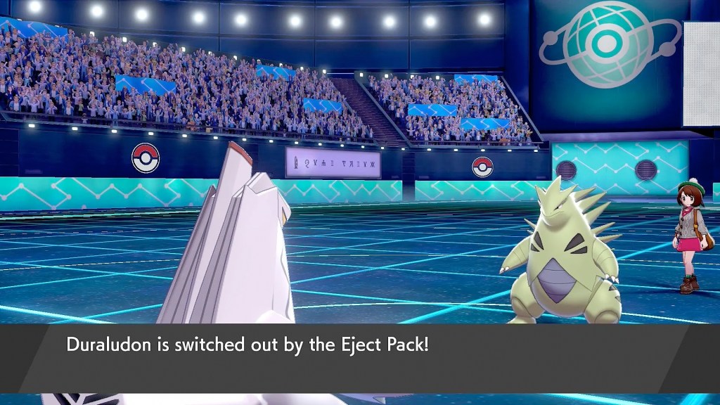
You begin a round of combat by selecting your desired move. If your monster is fast enough to take the first action, you are immediately re-told in plain text which move you just selected. Then the move’s corresponding animation plays. If the move inflicts damage multiple times, each hit gets an individual animation, then a text box summarizes how many times the move just hit. If the move has a type advantage or disadvantage against its target, this is communicated first with a sound cue, then with a discrete text box. Critical hits, if they occur, get their own text box as well. If your move inflicts a status condition, this is demonstrated first with an animation, then with a text box, every time the effect is triggered — usually once per round. The entire process then repeats for your opponent’s move, over and over again until the battle is over, for every battle in the game.
In most Pokémon games you can cut the battle time in half by disabling the animations. This is the opposite of the ideal solution. The text should not play the central role in combat: There is no reason that the series’s iconic “It’s super effective!” indicator still needs to halt the flow of combat with a text box — the phrase could simply pop up on screen when an attack connects. Status ailments no longer need to be re-introduced every time they trigger; their associated particle effects could just persist on the character models. Weather effects don’t need to be announced every single turn that they’re active; they’re already communicated by visual changes to the battlefield. In strategically complex battles, where multiple weather conditions and status effects are resolving every turn, single exchanges can take several minutes to complete.
Once you begin to be annoyed by these sorts of legacy time sinks, you start seeing them everywhere. Getting your team healed at a Pokémon Center — an extremely common occurrence — requires two text boxes, the insertion of all six of your Poké Balls into a device one at a time, then another two text boxes. Battles begin with a swooping camera to introduce your opponent and the dramatic deployment of your first critter. This creates a thrilling atmosphere the first few times, but it carves precious seconds out of your life when you’re 15 hours deep into the game, finished with the latest route, and just want to get to the next town already without contending with any more random battles.
The straw that broke the camel’s back for me in Pokémon Moon was the menus. Pokémon have small health pools and deal lots of damage to one another, so if you’re not over-leveled you’re probably healing up after every scrap or two. Restoring your team’s health requires opening the menu, opening the item sub-menu, selecting a potion, selecting a chap to use it on from the sub-sub-menu depicting all your chaps, then confirming that you want to use the potion on the selected chap. The menu cannot be closed all at once — there is no way to go from the chaps sub-sub-menu straight back to playing the game. You must reverse out of every geological stratum you’ve drilled through one at a time by hammering the B button, after every major battle, for the entire duration of the game. After about 20 hours, I just couldn’t do it anymore.
Pictured: Me.
Pokémon is slow to change, when it deigns to change at all, but the series has made meaningful strides towards improving its quality of life. Move-teaching TMs are no longer destroyed after a single use. As of Let’s Go Pikachu and Eevee, Pokémon can now be swapped in and out of your active party without having to visit a PC. Most importantly, the series has finally phased out HMs, the special moves that granted your critters new movement options in the overworld but were a logistical nightmare to keep organized.
And at its best, the series easily transcends its crummy user experience. Pokémon Shield has addressed none of these problems, but it might be my favorite in the series purely on the strength of its strong art direction and flavorful script. But these petty niggles can add up, smothering otherwise charming adventures with no-longer-necessary Game Boy-era workarounds.
Pokémon Sword and Shield didn’t cut too much. If anything, they didn’t cut enough. There are two decades’ worth of cobwebs hanging off this series that badly need to be blown away. That’s more important to Pokémon‘s long-term health than whether or not Tangela made the cut.